The Influence Of Graphic Design On The Modern NYC Subway Map » Dolo Digital Blog

The Influence of Graphic Design on The Modern NYC Subway Map

Graphic design helps us shape the way we understand things easier–whether it is through the use of infographics to illustrate data points, or by using imagery to conjure emotions or feelings–it is an essential part of marketing and media.

Graphic Design and Visual Communication

Graphic design can be found in the places we might not otherwise realize it exists in. One prominent example of this is in New York City subway cars, where a snaking grid of train lines and city landmarks encompass the map New York commuters use everyday to plot their route. The modern New York subway map was originally created in 1979 at the behest of the Metropolitan Transportation Authority, due to the growing complaints of passengers citing it was too confusing.

The 1979 NYC map contained train lines that were imaged by straight lines, causing riders to feel  distressed. 

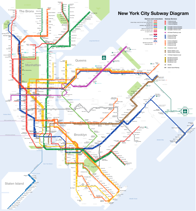
The M.T.A. took note, formed a committee and brought on the design firm, Michael Hertz, to create a new map that would give passengers a better sense of where they were and how to get around. What happened next was a fascinating and unique approach at making the new subway map. Primary designer, Nobuyuki Siraisi, rode each train line with his eyes closed and would sketch in his notebook how he perceived the way the train followed its track–detailing the curves and contours of the train path. The previous map used straight lines to indicate train paths, but this was disorienting to passengers. The new map addressed this issue. Colors were also a large part of the new redesign. Previously, the old map had everything in a beige palette. Siraisi colorized the train lines to make them easily identifiable, as well as adding colors to landmarks, bodies of waters and parks by using their natural color.

The modern NYC subway map is more colorized and has train lines drawn from the contours of how the ride is felt. This gave riders a better sense of direction and helped them navigate across NYC easier. 
The map has changed alongside with the city throughout the years, but the same design created in 1979 remains the same. We don’t always realize how important visual elements are at how we view things, but the redesign of the NYC subway map serves as a perfect example of how great graphic design helps us perceive the world a little easier. 
Search
Keith Krebbs

Keith Krebbs

Senior Designer

Not Your Average Newsletter

Sign up and receive the best email you’ll leave unread in your inbox.

share this on...

Facebook
Twitter
LinkedIn
Reddit
Pinterest
Email