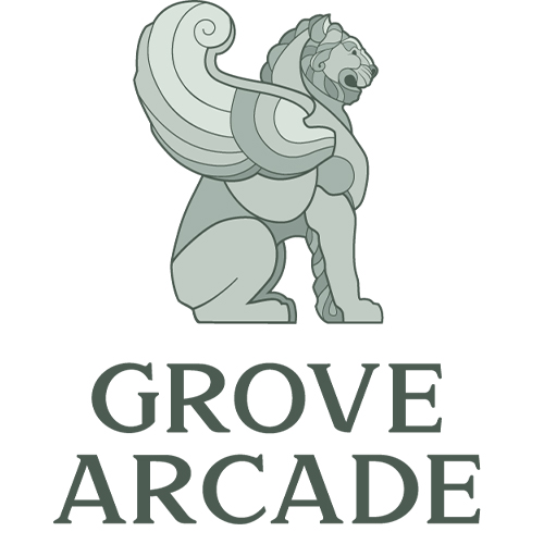
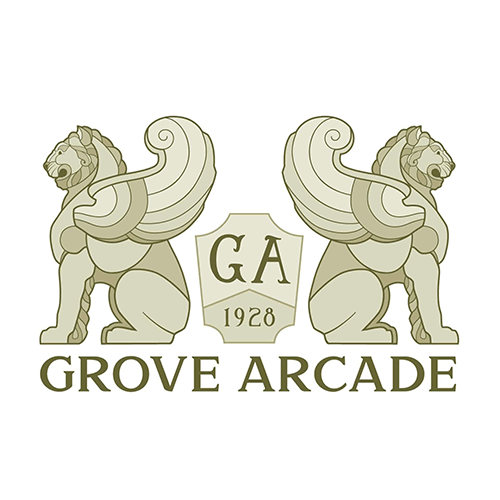
The northern entrance to the building is flanked by a pair of winged lions guarding either side of the walkway. These lions are an iconic feature of the building, so we definitely wanted to incorporate them into the branding in a significant way. Working from photos of the real life sculptures, we created a simplified vector illustration of the lion in profile using Adobe Illustrator. This figure lined up nicely next to the main word mark, creating the layout that was chosen for the full logo image. The font used in the word mark is Samford, chosen because it reflects the serif styled typography popular at the time of the building’s construction. In creating these new designs, we were constantly coming back to the origins of the space and the artisans that created the original structure.
Problem:
Need to create custom iconography for use on a new website.
Solution:
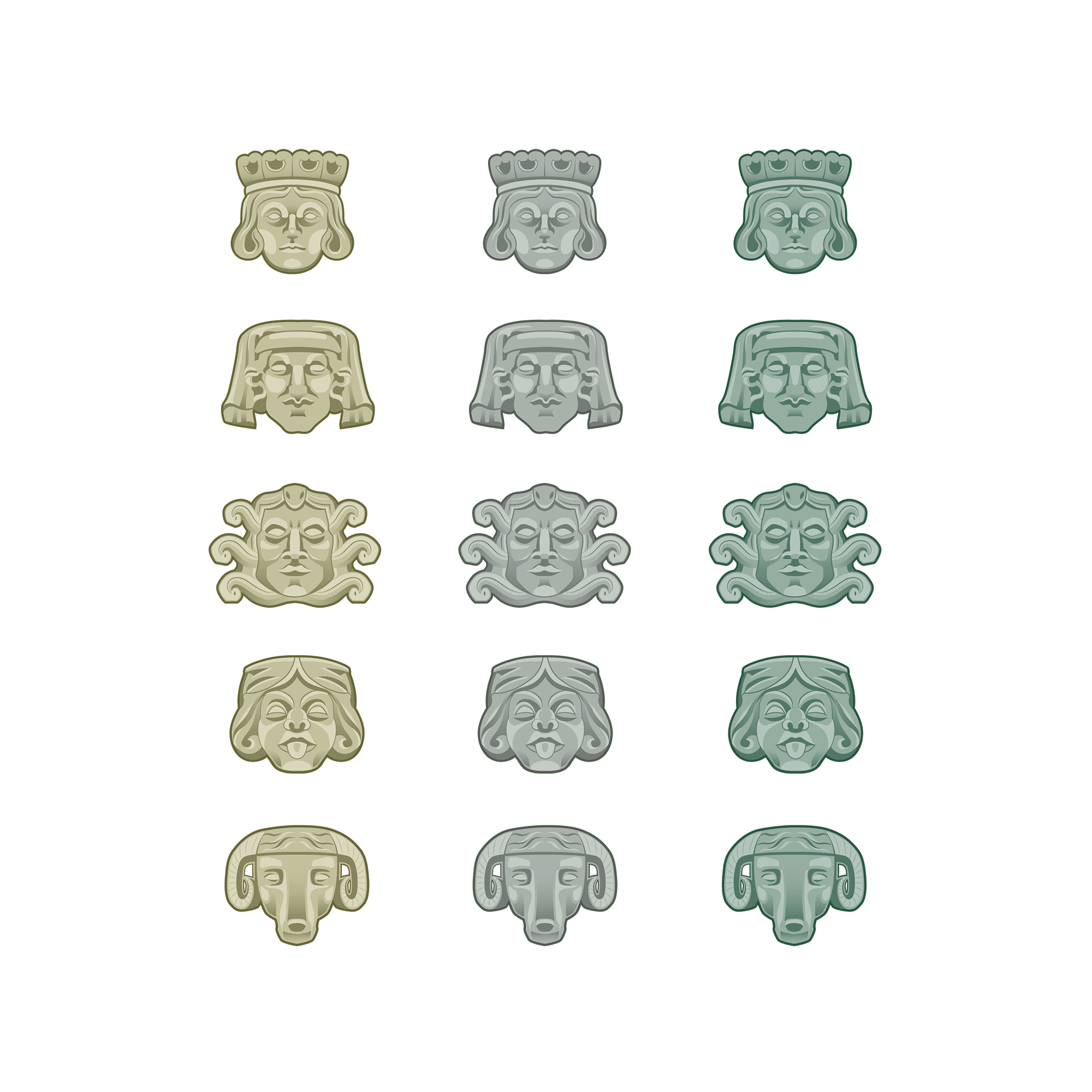
In our search for inspiration, all we had to do was look around the physical space and ideas started presenting themselves. The upper reaches of the interior and exterior are decorated with various carvings and grotesques depicting archetypal characters: The Prince, The Judge, The Medusa, The Jester, and The Ram. These intricate and expressive faces were not part of the existing branding, so when we needed to create some custom iconography for Grove Arcade’s website, they were a perfect fit. The faces had an angular and geometric style that translated well to vector illustration, and the details were simple enough that they could be reduced to work at smaller sizes with limited colors. By bringing these figures out of the architecture and into the branding, we were able to put a spotlight on a decorative feature that might otherwise be overlooked while staying true to the spirit of the building.